Style is not coincidence — it’s creation.
Owning your process takes vision
The journey behind each project begins with a story — your story. And sometimes, that story has already lived a previous life.
In the realm of circular fashion and upcycled design, we don’t just create: we listen, reinterpret, and transform. A garment with a past becomes the foundation for a new narrative.
An aesthetic that feels anchored in sustainability.
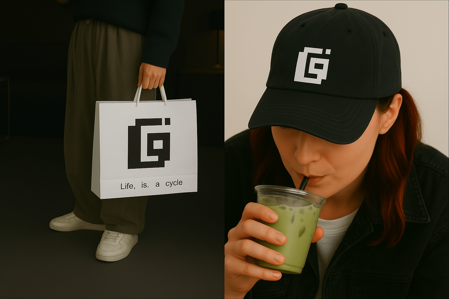
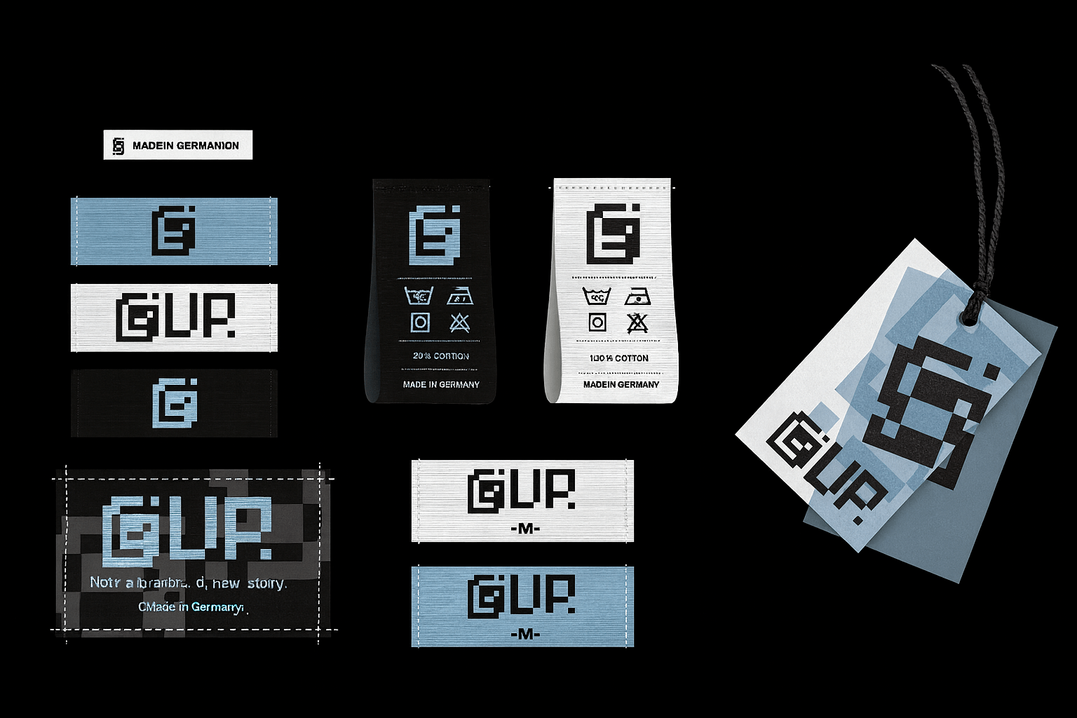
In this project, I crafted the visual identity for Lup. — from designing the logo and defining the color palette, to shaping an aesthetic that feels brief, expressive, and anchored in sustainability.
The brand philosophy and visual direction are built around freedom, individuality, and quiet confidence — values that guide both the identity and the creative act of renewing previously-lived garments.
Each transformation is intentional: a designer rewriting a piece through the lens of circular fashion upcycled design.
The visual system blends minimalism with subtle retro influences, creating space for personal interpretation. Every element reinforces the idea that clothing does not need to be loud to be meaningful — its value comes from the story it carries and the new one it becomes.
As part of the concept, I reworked several existing garments to reflect the spirit of Lup — turning essential pieces into new contexts rather than noise. Each one holds a past, yet expresses a renewed and conscious purpose.
Lup. — Not a brand. A story rewritten through circular fashion.
The philosophy of Lup. — where renewal becomes narrative
Lup. is rooted in the belief that clothing carries meaning far beyond materiality. Each piece holds traces of people, places, and moments. Instead of erasing that past, Lup. works with it — celebrating the beauty of continuity and the value of transformation.
The brand embraces three core principles:
-
Freedom — the freedom to reshape, redefine, and reimagine.
-
Individuality — every garment becomes a unique expression of its wearer.
-
Quiet confidence — an aesthetic that doesn’t shout, but resonates.
This mindset guided the entire visual identity: subtle, minimal, intentional, and designed to respect the rhythm of the garments themselves.


